Gavin McDermott
Landscape and Portrait Artist
Fundamentals of Portraiture, Week 3
22 Jan 2021
This week the session was an adventure into the world of colour… but not too much!
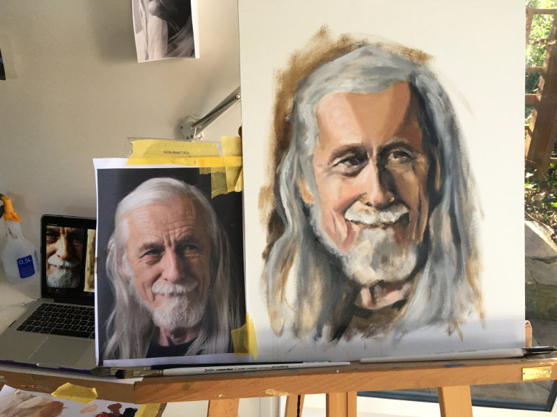
We were shown the work of the great Swedish painter, Anders Zorn, who–embarrassingly–I wasn’t previously familiar with. Sorry Anders.
The palette is two colours, with black and white, too:
- Yellow Ochre
- Cadmium Red (Anders used ‘Vermillion’)
- Titanium White (Anders used ‘Flake White’)
- Ivory Black
Ivory Black has a hint of blue, and a valid alternative is Raw Umber with a bit of transparent blue, such as French Ultramarine. And I have such an ingrained habit of never using black that this is almost a more comfortable alternative to me.
Two aspects of palette management were discussed:
- Light to Dark, with colours arranged white – ochre – red – ‘black’
- Warm to Cool, especially important with any of the greys from the ivory black which are really cool (because of the blue tones)
I’ve since read that a good way to manage a Zorn-palette is to keep a white – black transition completely separate from the other colours.
Our subject was from Week One, for which we’d already done an underpainting in Raw Umber, and had the tonal values and proportions sketched in.
Recent Learning Posts
Expressive Portraits, Week 4
Expressive Portraits, Week 3
Expressive Portraits, Week 2
Expressive Portraits, Week 1
Painting Children, Week 4
Painting Children, Week 3
Painting Children, Week 2
Painting Children, Week 1
Painting Figures, Week 5
Painting Figures, Week 4
Older Posts
Painting Figures, Week 3
Painting Figures, Week 2
Painting Figures, Week 1
Fundamentals of Portraiture, Week 5
Fundamentals of Portraiture, Week 4
Fundamentals of Portraiture, Week 3
Fundamentals of Portraiture, Week 2
Fundamentals of Portraiture, Week 1